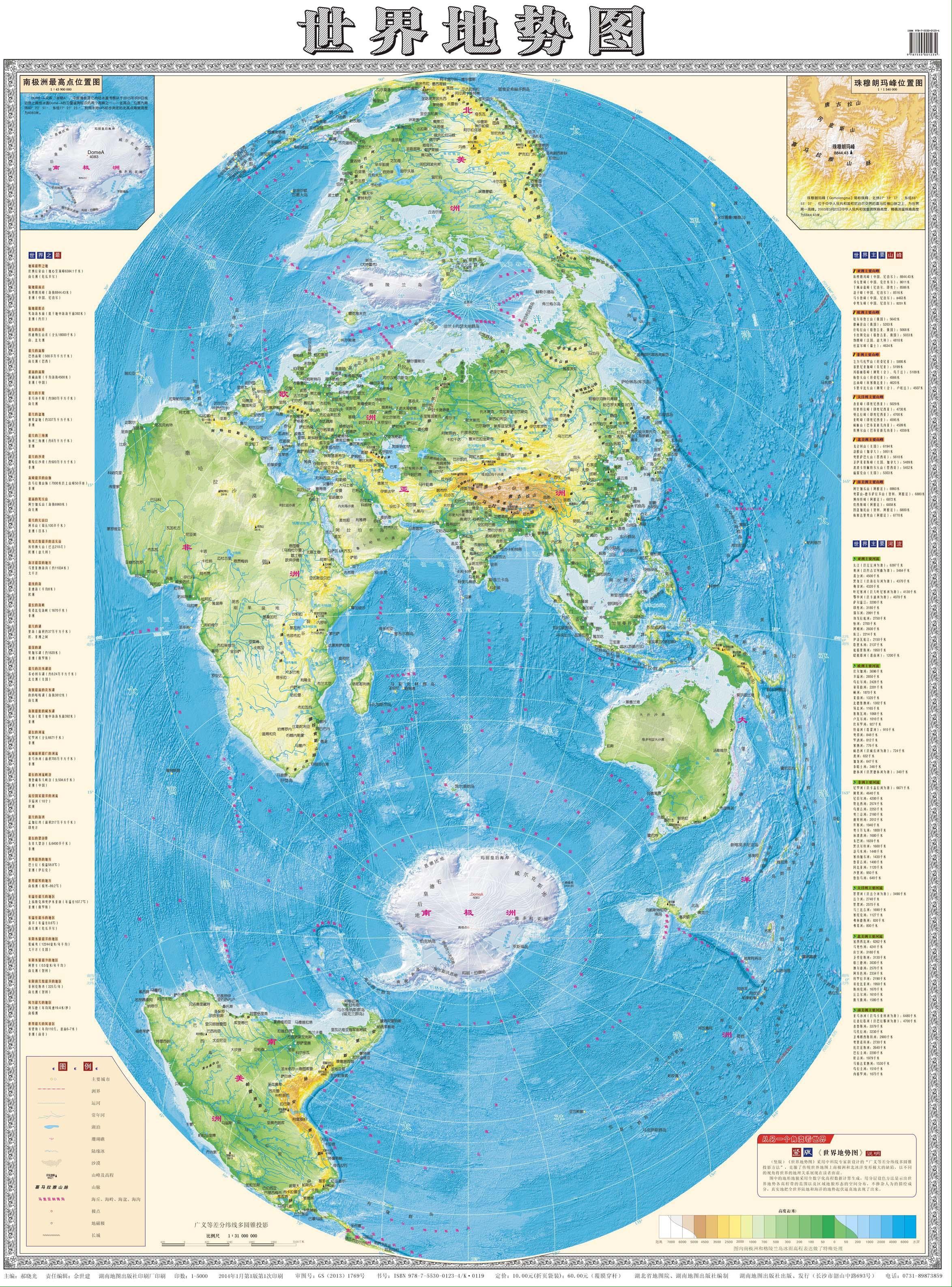
It’s fascinating to see a Mercator-style projection that does not produce a huge Greenland.
Maps like these must all have been frustrating to plot out before the advent of non-Euclidean geometry explained a bit better what was going on with the numbers, certain forks in the mathematical road taking you where things didn’t quite make sense, and there was nothing you could do about it, except start over from a different point and or geometrical approach.
Also, people figured out the Earth was round long ago exactly because of these sorts of discrepancies. There just wasn’t a lot of value in being hyper accurate since the purpose of a map before the invention of ocean ships was just walking from one city to another along roads.
I guess I mean the type of map that we grew up seeing in our schoolbooks and encyclopedias, the type that distorts the further you get from your starting point, but instead of putting Europe at the center of things, this map here starts from Asia, outwards.
EDIT: as such, it represents the Indian Ocean and South China Sea, Sea Of Japan coastlines more accurately (as would be seen from space), while the Mercator does it for the Mediterranean and middle Atlantic.


It’s fascinating to see a Mercator-style projection that does not produce a huge Greenland.
Maps like these must all have been frustrating to plot out before the advent of non-Euclidean geometry explained a bit better what was going on with the numbers, certain forks in the mathematical road taking you where things didn’t quite make sense, and there was nothing you could do about it, except start over from a different point and or geometrical approach.
How is this a “Mercator-style projection”?
Also, people figured out the Earth was round long ago exactly because of these sorts of discrepancies. There just wasn’t a lot of value in being hyper accurate since the purpose of a map before the invention of ocean ships was just walking from one city to another along roads.
I guess I mean the type of map that we grew up seeing in our schoolbooks and encyclopedias, the type that distorts the further you get from your starting point, but instead of putting Europe at the center of things, this map here starts from Asia, outwards.
EDIT: as such, it represents the Indian Ocean and South China Sea, Sea Of Japan coastlines more accurately (as would be seen from space), while the Mercator does it for the Mediterranean and middle Atlantic.